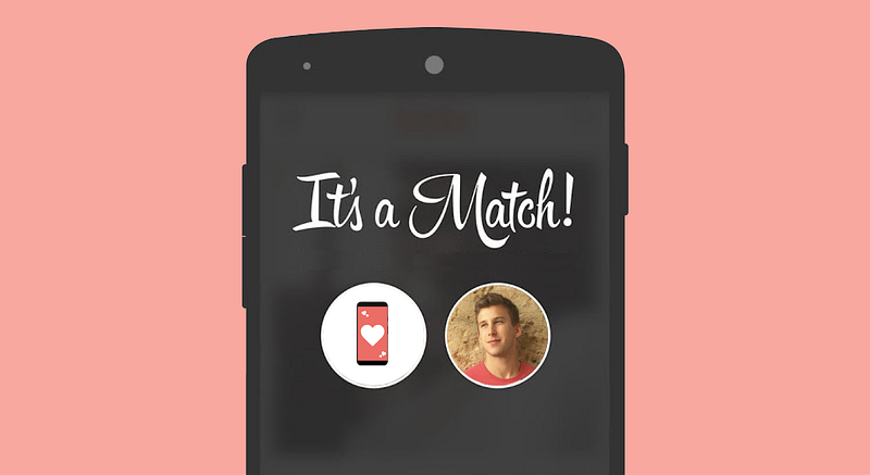
With Valentines Day fast approaching, we reflected on the effect technology has had on the age old quest for finding love (or at least for finding a date to get us through the holiday).
A number of us here at Sidebench HQ have had success with dating apps, so we were curious how they stack up from a UX/UI perspective. As Chase, our Business Analyst, is one of the only bachelors on the team, we tasked him with analyzing dating apps’ digital experiences. We sent Chase out into the online dating world, armed with his smartphone, and his UX hat on.
About Chase
- Originally from the East Coast (New Jersey)
- 24 years old
- Loves long Bird Scooter rides through Santa Monica
- UX/UI hobbyist
- No plans for Valentine’s Day (yet)
The Criteria (via Chase)
Prior to last week, I had never used a dating app before, and while I had some background information on how these apps work, I had little-to-no preconceived notions and did not know what to expect. After discussing my options with friends and looking on the App Store, the three apps that I chose to download were Tinder, Bumble and Hinge.
*Note that I did not use any premium subscriptions, I only used what was offered through the free app.*
I ranked each app on the following criteria on a 1–10 scale, with 10 as the absolute best :
- Ease of Navigation
- Readily Available Information to Match
- Chat Interface
Tinder
Ease of Navigation: 2/10
Readily Available Information: 2/10
Chat Interface: 6/10
Total: 3.3/10
Tinder was an interesting experience. As the OG dating app, I found it quite disappointing.
To start, the bar at the top of each person’s profile to indicate how many pictures there are, is incredibly difficult to see. Many potential matches have light background pictures and the white bar blends in too easily. Also, it is not intuitive or easy to find each person’s information (you have to select the tiny iin the corner of the screen).
When you navigate to the information section, it is also incredibly bare. For some people, the only thing I knew about them was their approximate distance (approx. 2 miles away for example), and it often left me wondering “does this mean they live close to me, do they work there, are they just visiting from another city/state?”
Other than that, there are no defined data points and somebody can enter what they please. Most often, I found the information to be irrelevant to what I was actually interested in learning about each person. Additionally, once I do get to the person’s information, there is no classic “back” button, but rather a down arrow.
After bouncing around to different apps, I find it difficult to remember the purpose of that oddly placed arrow. In terms of the chat interface, I thought it was decent and nothing special. It was pretty classic and got the job done, which is all I can really ask for in messaging apps.
Bumble
Ease of Navigation: 5/10
Readily Available Information: 5/10
Chat Interface: 7/10
Total: 5.7/10
Bumble reminded me, in many ways, of Tinder, but it is definitely an upgrade, though it’s still far from perfect.
I found the natural flow of pictures to personal information easy and comfortable. Unlike Tinder, Bumble shows each person’s bio as the last screen to scroll through. I also found that the swipe down navigation was seamless. My major qualm still, though, was the lack of readily accessible information on each individual. This time, Bumble at least always shows job or school, but I am still looking for more information about my potential matches other than what they decide is relevant.
When I matched with somebody, I did really enjoy the large “BOOM!” screen that appeared. It’s little things like that that make the experience enjoyable and makes each match feel special.
Within the chat interface, there are a few unique aspects that I found to be both positive and negative toward my experience. I like the fact that each chat has an expiration. If a match doesn’t get back to me within 24 hrs, it is gone. This makes sense to me and removes any anxiety or worry about receiving a message. If I don’t get a message, I simply move on to the next one.
One feature I initially thought would be a positive experience within Bumble’s chat is the fact that the women I match with have to message me first. As a pretty shy and introverted guy, I thought this would be a fun change of pace, but I occasionally found that I had some top notch material and was left waiting for a message. Again, similar to Tinder, there is nothing special with the actual messaging platform, but it gets the job done.
Hinge
Ease of Navigation: 9/10
Readily Available Information: 9/10
Chat Interface: 8/10
Total: 8.7/10
While I have not reviewed every dating app on the market, I can definitively say that of the three I tested, Hinge is the gold standard. I felt the experience to be much greater in almost every way.
Hinge made the overall process and experience in dating more personal and made it easier for me to engage with matches.
The first thing that stood out to me was the content included within each profile. In addition to the pictures, each person is required to include other tidbits of info: a favorite meal, two truths and a lie, or even an old high school detention story. Immediately, I felt like I knew each person a little bit more and if one of those tidbits resonated with me, the connection was stronger than with other apps.
Additionally, Hinge utilizes a unique liking style where you don’t just like somebody. Instead, you like a specific aspect of their profile — one of their pictures or one of those tidbits. And when you like an aspect, there is room to enter text and provide input or pose a question on that aspect. One of my major difficulties with dating apps is “How in the world do I start the conversation?” and Hinge immediately removes this issue by create a simple solution to smooth the introduction.
One of my favorite parts of the app is the added “Likes You” section. Other apps only show the people who like you once there is an actual match. Hinge shows your admirers prior to matching. The section as a whole isn’t absolutely critical to using the app, but it does make me feel good opening an app and seeing those who like me. It’s that warm and fuzzy feeling that keeps me engaged and coming back for more.
After reviewing Tinder and Bumble, I figured that it would be pointless to review the chat interface since there seemed to be little to no variation. I was quickly proven wrong with Hinge. The two tabbed interface that lets me toggle between the chat and the profile is definitely an added bonus. I can go back to check on what she said her favorite meal was or where her dream vacation is, and easily address those in conversation. Going back to the other apps, I realized how annoying it is to navigate between chat and profiles.
Hinge also combines chat aspects of Tinder and Bumble. I like that once we match, there is the option to start the conversation on my end or pass to them. Choosing whether or not to engage first establishes responsibility and is just enough added pressure to get me to start talking.
Conclusion
After this experiment, I can say that all three are worthwhile dating apps, however, not all are not created equal. Tinder and Bumble tend to be on the leaner feature side, which can be beneficial in some cases , but I found that the clear differentiator was the more personal touch provided by Hinge. At the end of the day, I think I’ll stick with Hinge as my best bet to secure Valentine’s day date.


