Are you left-handed? Have you noticed that many tools are built for right-handed people? If you’re tall, do you wonder why the tray tables on an airplane bang up against your knees all the time? If you wear glasses, do you find it annoying that you need to take them off to use a virtual reality headset?
These are minor annoyances — but they point towards a deeper truth — these products were designed by people who weren’t thinking about you when they designed them. Imagine what this is like if the whole world was designed by and for people not like you, and you begin to realize the challenges faced by persons with disabilities. As designers, this doesn’t sit well with us.
That’s why we teamed up with the WITH Foundation — a non-profit foundation dedicated to promoting comprehensive health care, deep empathy, and design focused on the needs of adults with developmental disabilities— to create a workshop that teaches tech product designers how to design for a more accessible world.
“A disability only hurts functioning to the extent that a culture lets it. “ — Emily Morson, IU PhD student in developmental cognitive neuroscience with ADHD
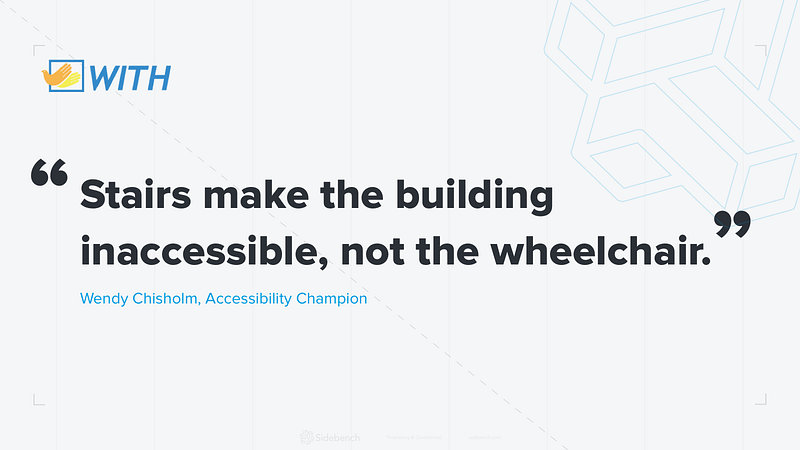
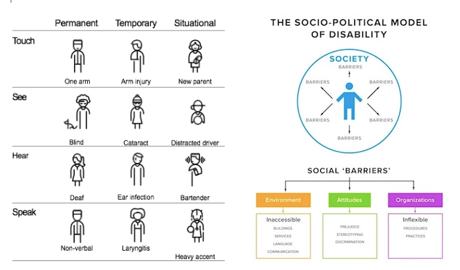
This is the core tenant in the socio-political model of disability. In this model, the world created by people without disabilities is the obstacle to accessibility — not the disabilities themselves. An estimated 1 billion people worldwide and 18.7% of Americans have at least 1 disability. That accounts for over 40 million people in the United States. User testing and user research are a significant part of the design process, however people with disabilities (PwD) are typically excluded from the majority of these conversations and considerations.
In March, Sidebench and the WITH Foundation hosted the first 1-day pilot workshop, bringing a small group of the LA design community together with PwDs to promote universal design — the design and composition of a technology so that it can be accessed, understood, and used to the greatest extent possible by all people regardless of their age, size, ability or disabilities. Universal design creates an opportunity to ensure a significant portion of the American market can utilize our day-to-day technologies.
The Workshop
The day was split into two sessions. The morning was created for the designers to build empathy through guest speakers and challenging assumptions, while the afternoon gave PwD time to interact with the designers and become user testers. The designers morning session covered four very important concepts; persona spectrums, the socio-political model of disability, inclusive design best practices, and the benefit of accessible design to everyone. The designers were then tasked with the challenge of designing a prototype and practice the concepts they had learned during the afternoon session.
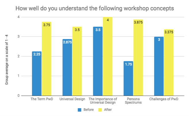
As our aim was to promote and educate people about universal design and the concepts surrounding it, we were excited to see the workshop exceed our original expectations. The designers were polled on their understanding of the concepts before and after the workshop and in each case, the group’s knowledge improved significantly.
75% of the designers had no prior knowledge of universal design best practices. The concepts introduced in the morning discussion left the designers not only understanding more about PwD, but empathetic to the challenges they face. On a scale of 1–4, we saw an increase in understanding from the group about the term universal design from 2.875 to 3.5, a rise from 3.5 to 4 for the importance of universal design and their understanding of the challenges of PwD develop from 3 to 3.75.
Key Takeaways
Sidebench UX Designer Katherine Van Winkle said she was most surprised at “how well-intentioned designs can end up being super confusing and unusable” and went on to say that “that’s why testing and talking to people is so important, especially people with disabilities whose perspective you may not consider upfront.”
Another common lesson learned was to not assume too much before starting research. By taking time to ask questions of the user, designers could better understand in what ways their design could be more accessible. UX Designer Cassy Castellio’s advice is to “keep asking questions, even if they seem obvious, or that asking them wouldn’t yield new info — you’ll be surprised.”
Designers also left the workshop with very specific design techniques they could use. They saw the benefits of using capital letters instead of lowercase, high contrasting colors, and obvious organization to represent hierarchy. UX Designer Dianne L. Chen’s main takeaway was “with the trend of minimalism, it’s important to consider the purpose of affordances that might go against the mainstream.”
The results of this first workshop are encouraging for us at Sidebench and WITH Foundation. The feedback and takeaways demonstrates that understanding the concepts, hearing from guest speakers and meeting with PwD to understand their challenges achieved our goal of creating empathy and challenging the assumptions of the designers.

